Some details in this design project breakdown and designs have been omitted or modified to remove and protect client data/intellectual property.
Project Summary & Role
As the UI/UX Design Lead for the development of the industry-leading "Area Summary View" feature for Cambio™ Geo Asset management software, I spearheaded the design strategy, conducted extensive research, and collaborated closely with stakeholders, clients, and development teams. My responsibilities included creating wireframes and prototypes, facilitating usability testing, and preparing comprehensive design documentation. This project resulted in significant time savings, positive user feedback, new revenue opportunities, and set a new standard in the industry.
Cambio™ GIS Enterprise SaaS Platform
The Cambio GIS Enterprise platform integrates advanced mapping, real-time monitoring, remote sensing, and AI-driven predictive modeling to optimize geospatial asset management. By consolidating data into a single geospatial view, it enhances decision-making, risk mitigation, and operational efficiency across industries like oil & gas, mining, transportation, rail, hydropower, and municipalities. The platform currently manages over 10,000 km of infrastructure, highlighting its extensive capabilities.
UX Problem and Key Findings
While evaluating risk as part of their workflows, users, particularly those managing large client portfolios with numerous geo assets, needed to view all hazards in a given area and understand their impact on each asset.
However, existing workflows were static and sequential, making it difficult for users to quickly analyze and QA these areas. Our research revealed that users struggled to access comprehensive area information because it could only be viewed per individual asset. This scattered the necessary data across different locations in the interface, leading to increased task times, higher error rates, and a disjointed user experience.
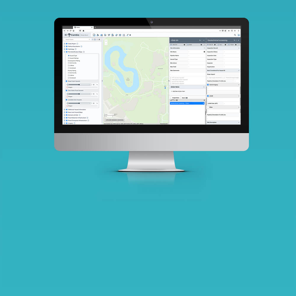
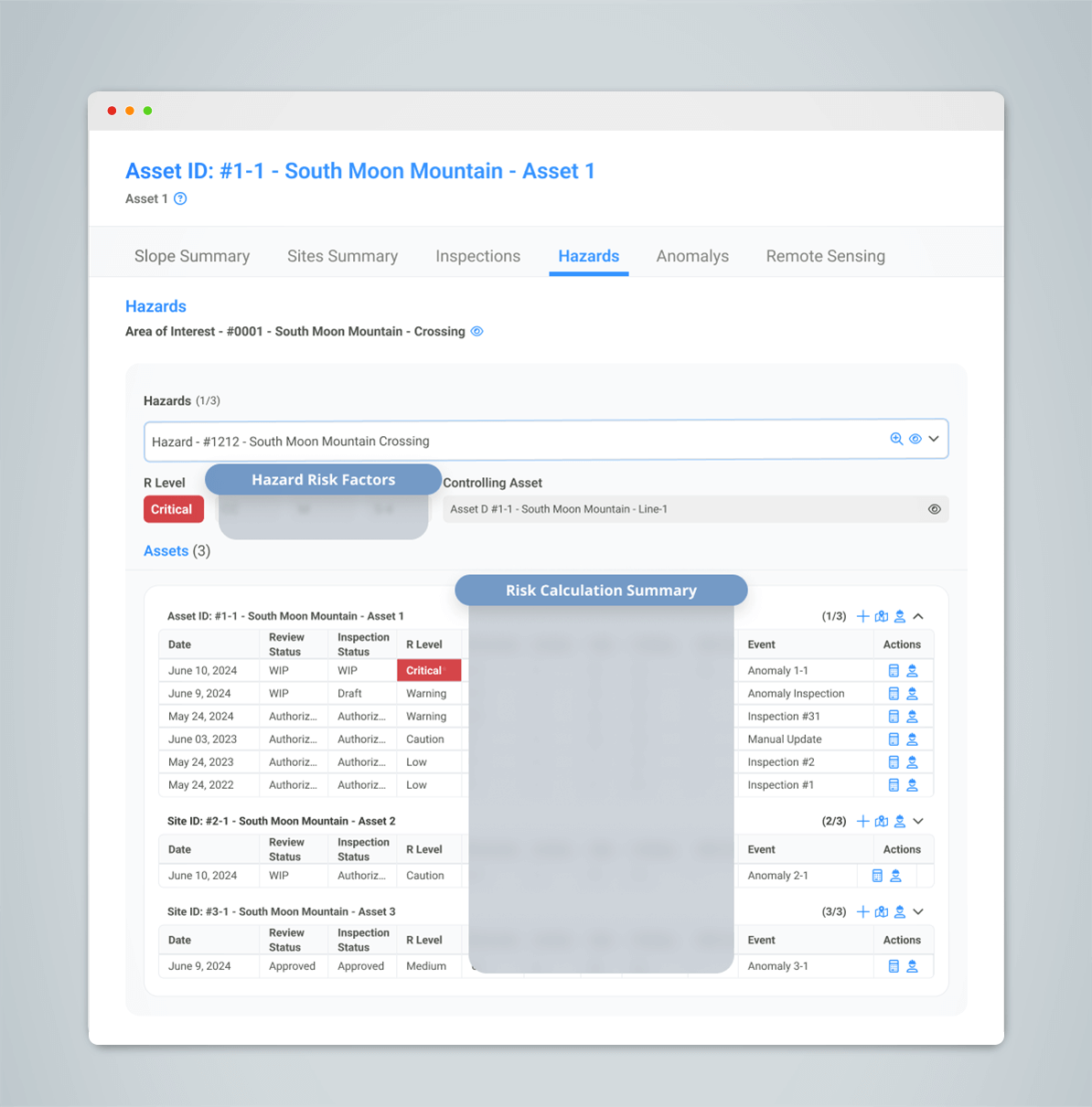
Area Summary Tab
The new area summary tool opens in a separate browser panel with the "Area Summary" tab focused. This tab allows users to quickly investigate hazard ratings and historical changes for grouped areas and their impact on geo assets in the region. It serves as the navigation hub, enabling users to switch between tabs and launch specific data and map views in the main Cambio application.
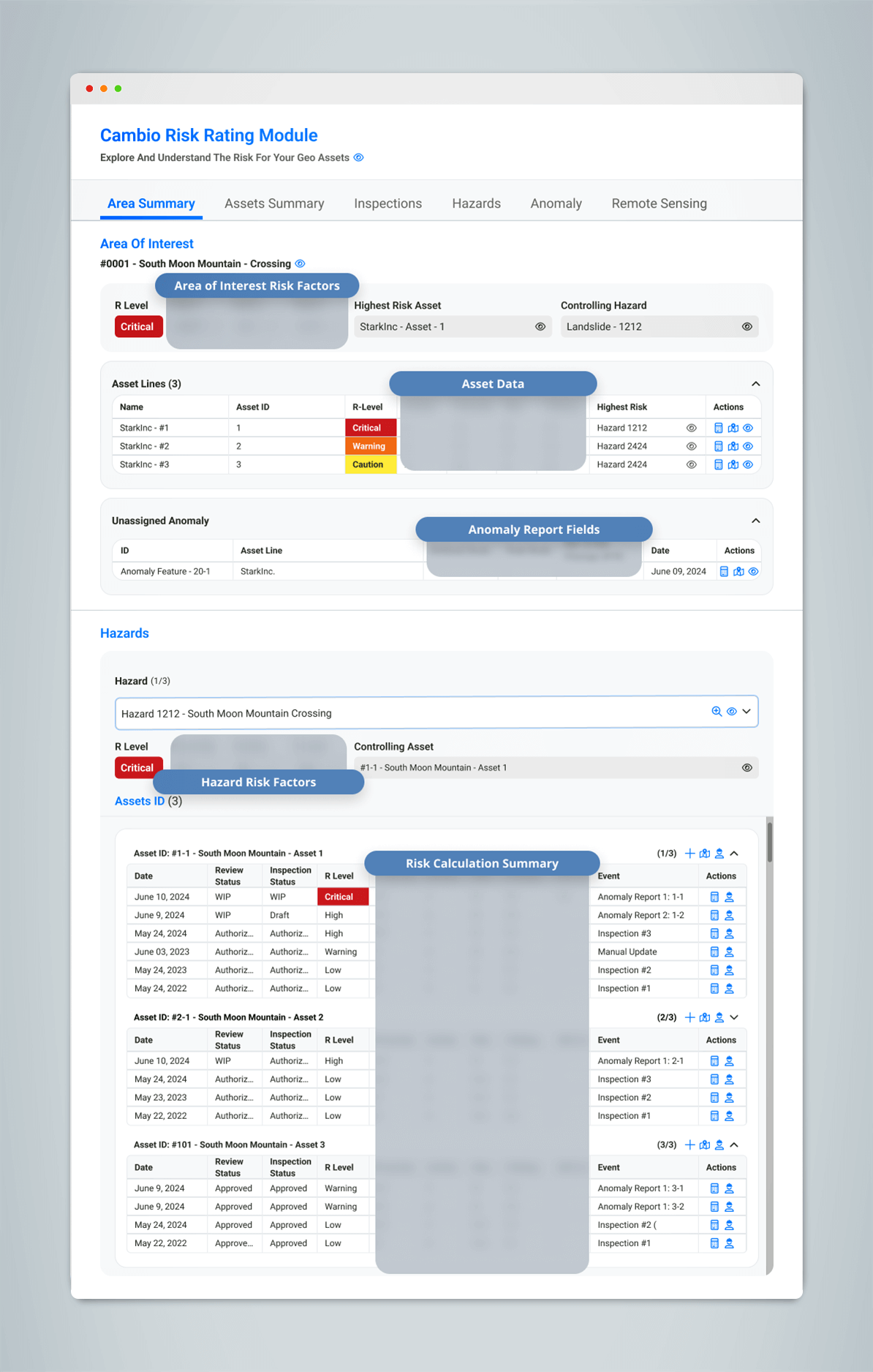
Hazards Tab
Summarizes each hazard in the area, detailing how individual hazards impact each geo asset and contribute to their risk rating calculations.
Objectives & Scope
Methodology
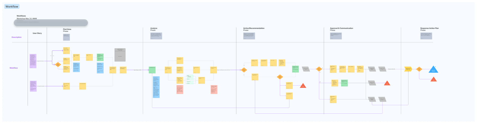
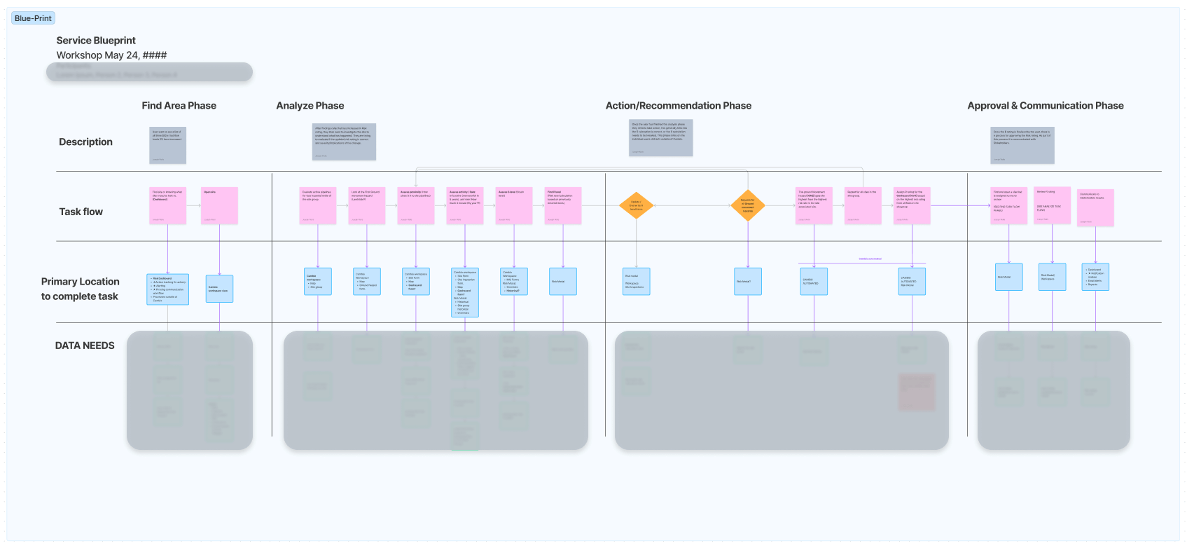
The design process was rooted in comprehensive research methods, including interviews, surveys, and observational studies with primary users, clients, stakeholders, and the development team. These efforts were supplemented by brainstorming sessions, sketches, initial concepts, and competitive analysis, all of which played a critical role in shaping the design at each stage.
Building on this foundation, user flow diagrams and service blueprints were developed to map navigation and seamlessly integrate new features into existing workflows. Wireframes and prototypes were then created to gather rapid feedback, allowing for iterative refinements guided by Design Thinking principles. Throughout the project, an Agile, user-centric approach ensured that continuous feedback from usability testing sessions was incorporated, ultimately leading to a design that effectively meet user needs.
User Needs
To address these issues, clients and users highlighted the need for a comprehensive solution that would streamline area investigations and the QA process. They required a feature that would consolidate various data se8ts—previously dispersed across different interface areas—into a single, navigable view. This would significantly reduce task completion times, improve user flow, and decrease error rates, ultimately enhancing overall efficiency and effectiveness.
Building on this foundation, user flow diagrams and service blueprints were developed to map navigation and seamlessly integrate new features into existing workflows. Wireframes and prototypes were then created to gather rapid feedback, allowing for iterative refinements guided by Design Thinking principles. Throughout the project, an Agile, user-centric approach ensured that continuous feedback from usability testing sessions was incorporated, ultimately leading to a design that effectively meet user needs.
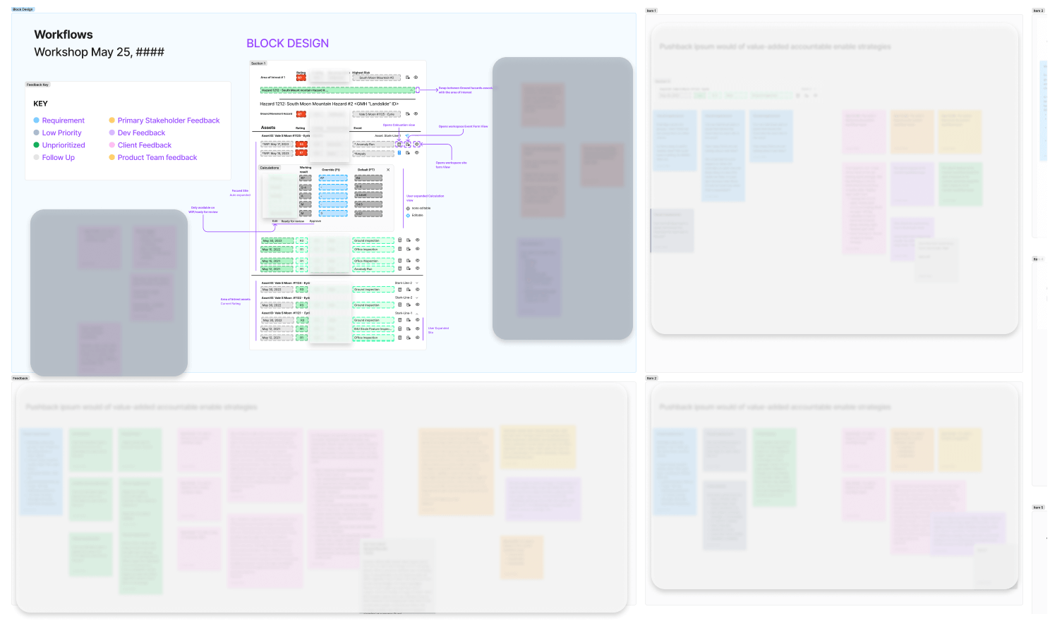
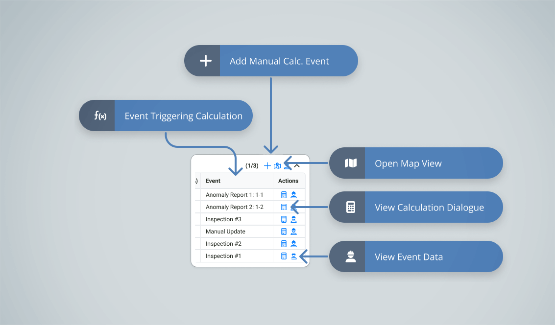
UX Artifacts Examples
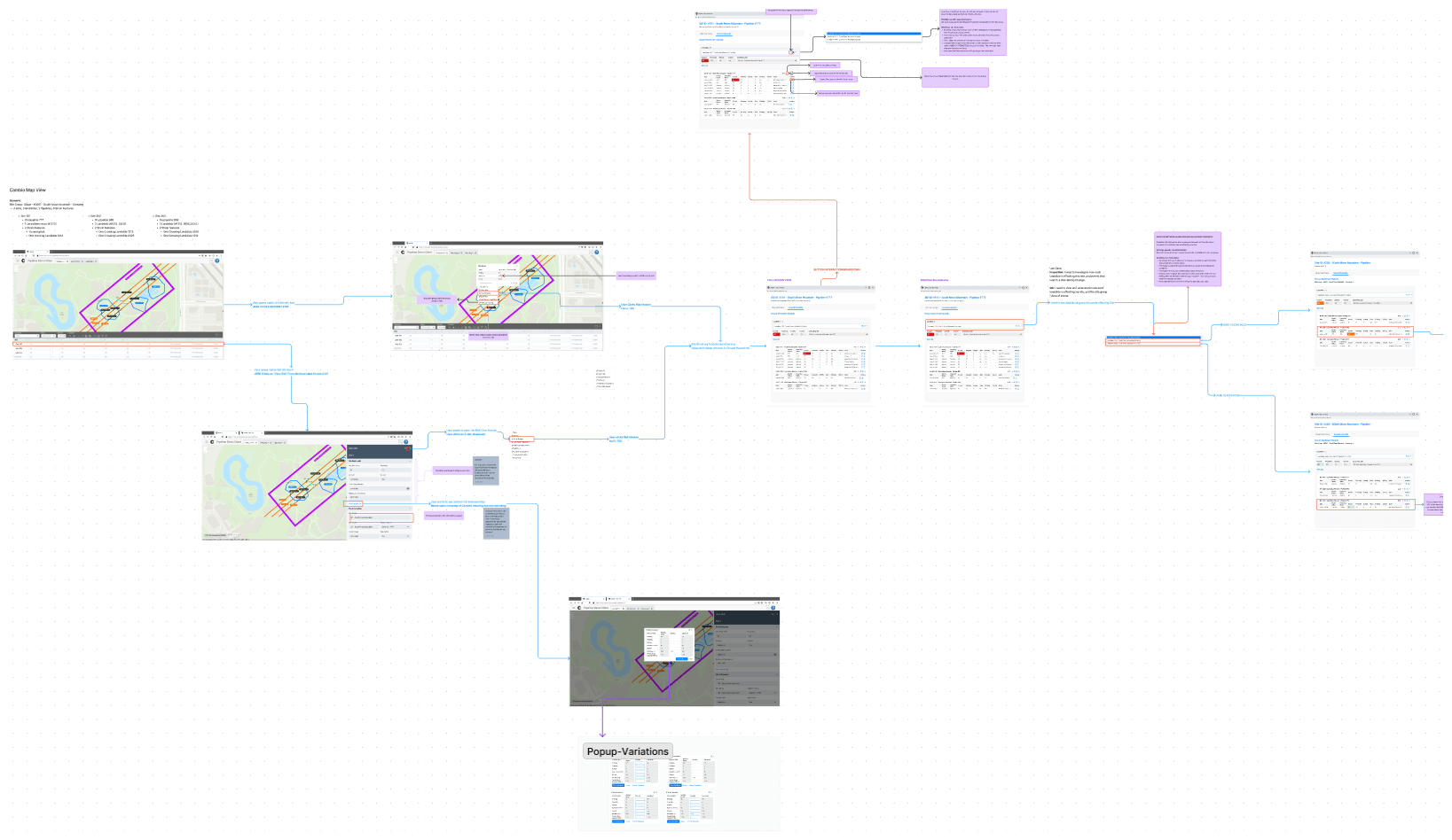
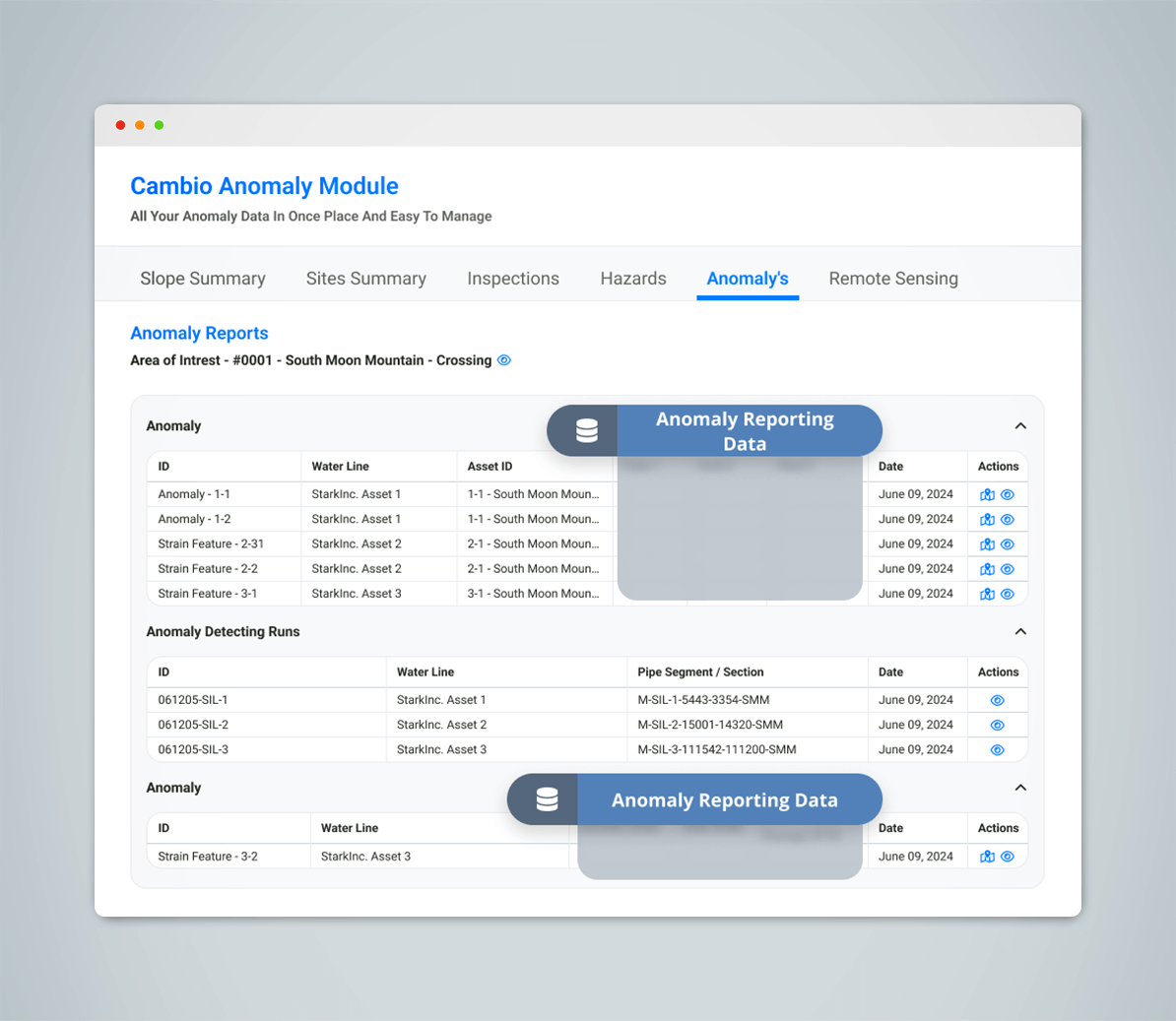
Anomaly Tab
Aggregates data from various Cambio datasets to identify anomalies in the area that may indicate emerging hazards. These anomalies require flagging and prioritization by users for in-depth investigations, including air, ground, and remote sensing.
Project Challenges
Technical Challenges
- Integration with Legacy Software
- Faced challenges integrating new front-end components into the legacy architecture, requiring close collaboration with the development team to ensure compatibility across both older and newer codebases.
- New Display Method
- The new feature required a separate browser window for display due to its size, requiring communication between the new interface and the main application.
Design Challenges
- Balancing Roadmapping and Stakeholder Expectations
- Ensured alignment by conducting regular check-ins, rapidly gathering feedback, and identifying additional use cases for the new feature.
- Usability Testing Feedback
- Early usability testing provided critical insights, leading to iterative design adjustments for a user-friendly interface.
User Challenges
- User Testing Feedback?
- Users still found the updated workflow in prototypes too segmented, and the method for overwriting data was confusing. This required reworking the user flows and prototypes, as well as conducting an extra round of user testing that was not initially planned, to ensure the workflow was optimized.
Project Conclusions
Project Outcomes & Learnings
The "Area Summary View" feature received positive feedback from users and stakeholders, improving user experience by streamlining workflows, reducing navigation time by 30%, and cutting task clicks by 60%. Automated reporting saved users 20 hours per month, with dynamic dashboards enhancing asset health visibility. This project also reinforced the importance of user-centered design, iterative testing, and cross-functional coordination, which will inform future projects.
Future Directions
Focus on optimizing the interface for various user roles and offering customization options. Continue integrating advanced analytics, machine learning capabilities, and developing both the area and object summary views, aligning with the product roadmap. The project established a solid foundation for future upgrades, ensuring ongoing improvements and scalability.