What is a Tiered Color Token System?
Handling colors is a crucial aspect of any design system. Most modern design systems use a token system, but when dealing with complex, data-driven software, you need to delve even deeper. Think about components like charts, tables, maps, and graphs – they can require over 20 colors, each with its own unique requirements.
That’s where a tiered color token system comes in. This article breaks down how to manage complex color needs using a tiered token system, with examples shown in Figma. Whether you’re dealing with detailed data visualizations or intricate UI components, this tiered approach can help keep everything organized and consistent.
Why Use a Tiered Color Token System
Handling colors in complex, data-driven software can be tricky, especially when you need to keep everything consistent. Here's how this tiered color token system can make your life easier:
Support Light & Dark Mode
For many enterprise and business-level SaaS, accessibility is not a nice to have — it’s a requirement. Light and dark modes are more than aesthetic choices — they support user comfort, reduce eye strain, and are essential for users working in different lighting conditions. By structuring your token system to define and separate light and dark values early, you make it easier to maintain, test, and scale these modes across your product.
Reskin & White Labeling
For many enterprise-level & business level SaaS, letting clients update the visual look and feel to match their branding is a big selling point and a major revenue stream. Reskinning usually means updating branding colors, logos, and styles to fit the client's requirements. A tiered system makes it easy to tweak these aspects at a global level, making reskinning or white labeling quick and efficient.
Accessibility
Accessibility is core to any modern application, but traditional color systems often fall short because there are so many different accessibility needs to accommodate for. With this tiered system, you can control colors globally by swapping Figma variable modes and adding a few lines of front-end code. This makes it easy for users to switch between different color blind modes through a dropdown menu, improving accessibility without a ton of extra work.
Easier to Manage & More Control of Your Colors
With this tiered system, you can easily adjust individual elements by tweaking a few variables at the correct tier. This requires clear definitions of which types of color variables go into each tier, making color management more straightforward and organized.
Requires Less Capacity
This system makes it easy to test different color variations. While being flexible enough to still define colors at the WIP level, you can quickly finalize and merge component colors, making the prototyping process smoother and more efficient.
Easier to Build in Features for Prototyping
Managing and maintaining colors across different design and development teams can be a nightmare. This tiered color system shifts the responsibility for managing colors onto the UI team, reducing inconsistencies and creating a more unified design. With in-depth documentation, developers rely less on designers for color decisions, freeing up both development and design capacity.
Makes A/B Testing a Breeze
A tiered system is flexible enough to allow you to change one or two color modes (in Figma or the front end) with minimal code changes. This simplicity makes A/B testing far easier to manage, enabling quicker iterations and data-driven design decisions.
Replicated in Front-End CSS/SCSS Structures
To support light and dark modes, and accessibility, the tiered system must also be replicated in the front end. Collaborating closely with your front-end development team from the beginning ensures that this color solution is effectively implemented, maintaining consistency between design and development.
Best Practices
Split Your Color Tiers into Individual Library Files
Splitting up your color tiers into individual library files makes your color system easier to manage. Here’s why:
Document, Document, Document!
Keep a living, always-updated document with all your colors and their specific tokens. Add definitions and use cases for each color wherever possible. This keeps designers on the same page and lets devs make quick, confident color choices without having to check in with the design team.
Tier 0
Hex Colors & Brand/Client Colors
Tier 0
The base level tier is the foundation of your color system and should rarely be modified. This is the only place where you add #Hex codes. Every tier after this should reference a variable defined here to ensure consistency and simplicity across your design system.
What's Defined at This Level
Brand Color Scales & Client Reskins
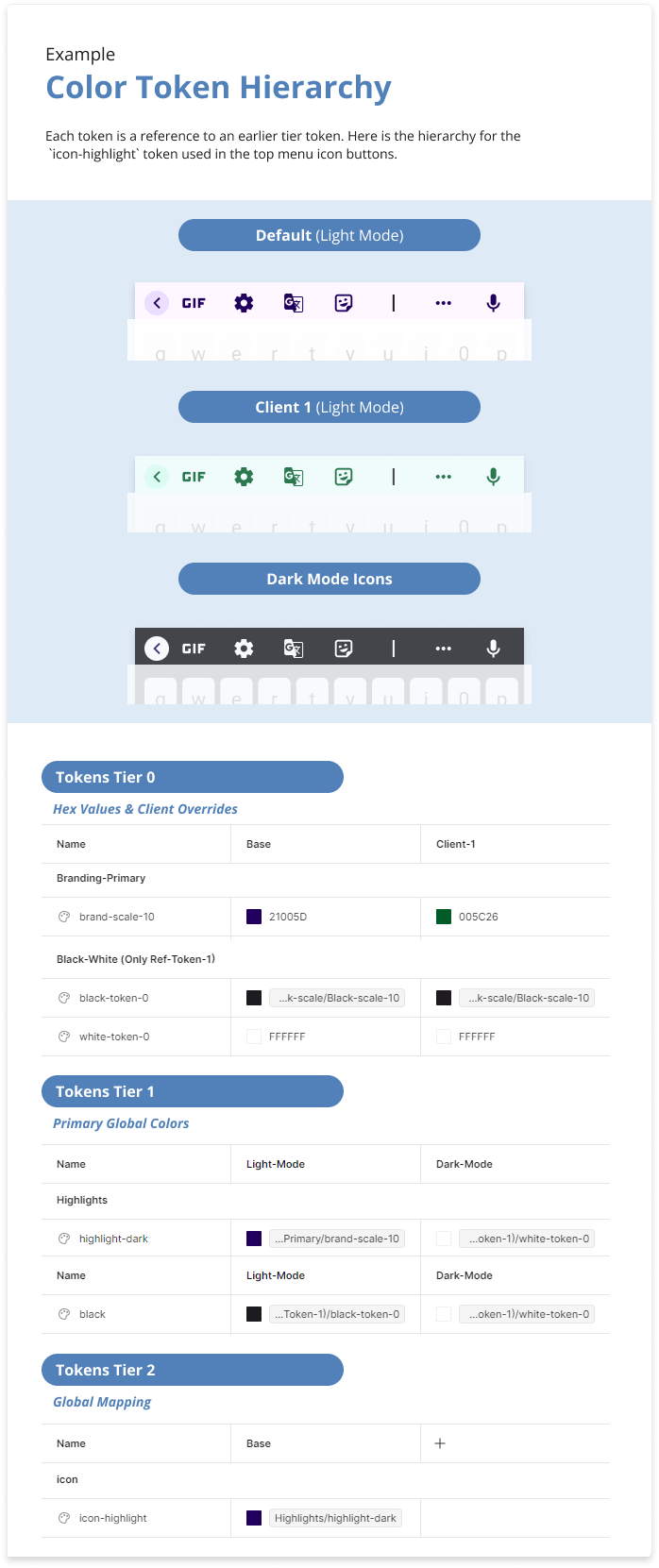
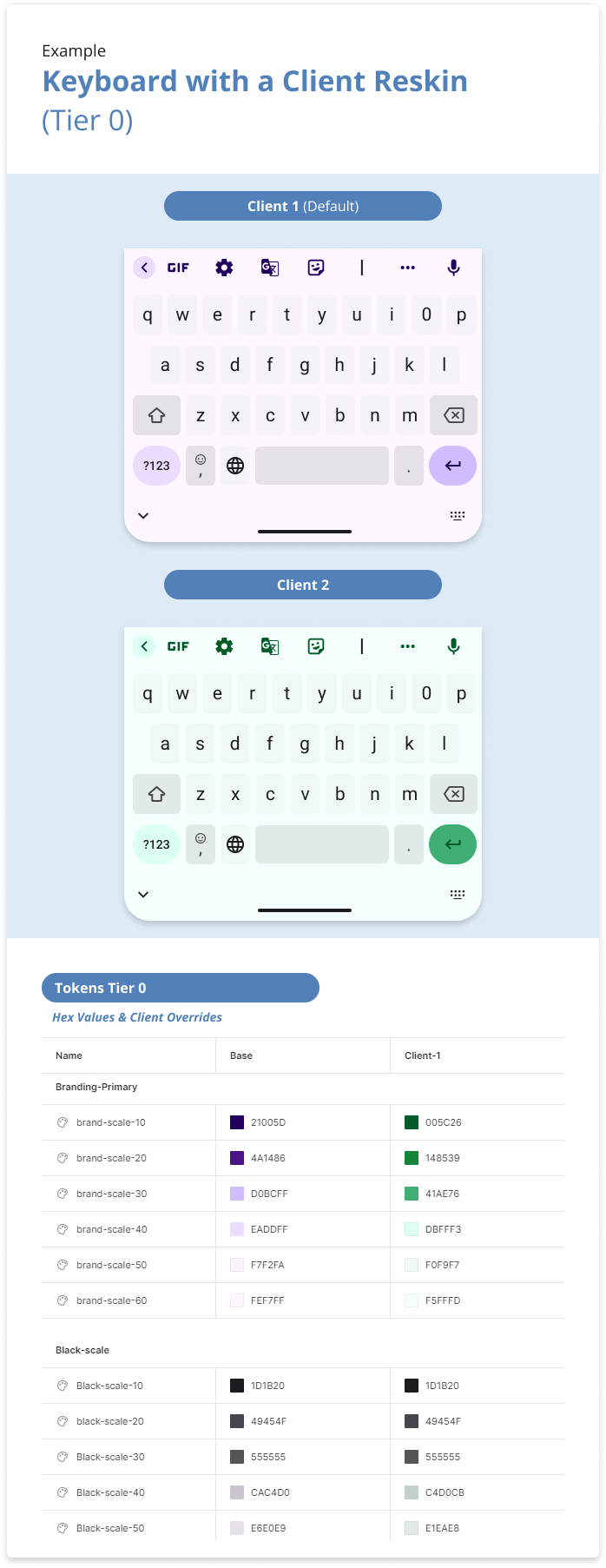
Primary and secondary colors that define your brand’s identity are defined in Tier 0. This level also handles reskin colors for different clients, creating a "New Variable Mode" to override brand-scale hex codes and accommodate alternate color schemes (see example).
Interface Neutral Color Scale
The Interface Neutral Color Scale, or Black/Grey Scale, is an additional color scale designed for neutral items within the application, such as outlines, table separators, and stroke colors. This scale ensures that these colors remain unchanged across most client reskins while maintaining the ability to be adjusted for specific requirements such as light/dark versions and accessibility modes.
White & Black
Black and white hex codes are universally defined in Tier 0, while light/dark mode is handled in Tier 1 (see next section). Defining white and black in Tier 0 allows us to tweak each on a global scale in one place, which is often necessary for client reskins where many brands avoid using a full #000000 black.
Pro Tips
Use a Color Scale Method
Check out my second article in this series to learn more about color scales and why they are the foundation of this approach. Using a color scale method ensures your system is consistent and adaptable.
Naming Conventions
Getting naming conventions right is the secret sauce to success. Think about how you’ll search for colors in the Figma library color dropdown. A solid naming system cuts down on confusion and keeps things consistent among designers. Team up with your front-end crew to match design names with code variables, making handoffs smoother since developers can pull the variables directly. Skip the capital letters in your Figma naming system to align with CSS conventions, making the process even simpler.
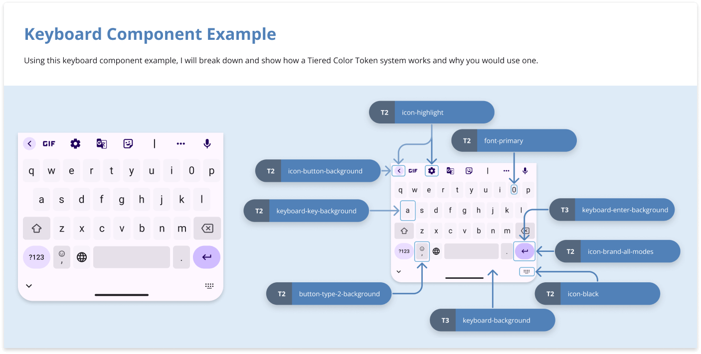
Tier 1
Global Colors
Tier 1
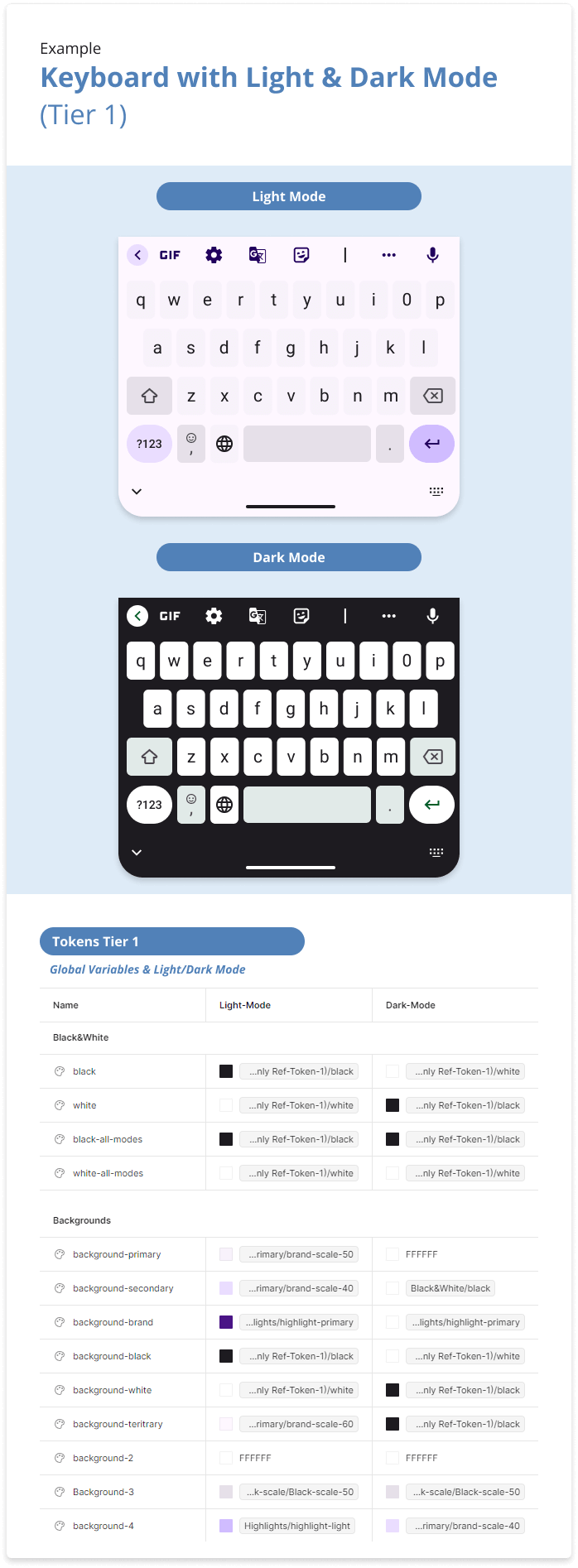
In Tier 1, the idea is to define simple global variables that the next tier will pull from. This tier maps out primary global definitions that need to be dynamic for light/dark mode and draw from your brand color scales. By setting specific colors in Tier 1, you can control how they behave across different modes.
Primary Definition Examples
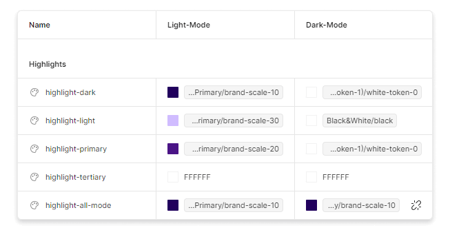
Highlights
Highlights are typically pulled from your brand scales. These are used for items like buttons, backgrounds, icon colors, hyperlinks, and titles (which should be defined in Tier 2).
Background Colors
These usually refer to container backgrounds. Instead of directly referencing the Tier 0 token, these should reference “Highlight” tokens when using branding colors. This ensures that background colors automatically adjust based on Tier 0 mode changes.
See exampleBlack & White
Tier 1 adds a “Variable mode” into the Figma variables table to map out the changes between light and dark modes. This is important when dealing with black and white, which need to be swapped in light/dark mode but in some cases need to remain the same. This also gives you more control over how specific colors function in different modes without defining specific components like font colors at this level.
See example for how to handle the black and white definitions.Dark/Light Mode Variations
As you continue to devlop your design system and UI, you'll encounter cases where specific backgrounds need to react differently in alternate modes. Whenever possible, add a variable at this level to handle these variations. This makes light/dark mode swapping manageable at Tier 1. For more specific component handling, refer to Tier 3 below.
Tier 2
Global Mapping
What is Defined at This Level?
Tier 2 will be your biggest file. It's also the only library that needs to be included by default in all Figma files. At this level every color should reference a color from tier 1, which will requiring making new level 1 tokens as needed (and tier 0 for hex codes), for your sepcific design needs.
Here are some examples of what you define in tier 2
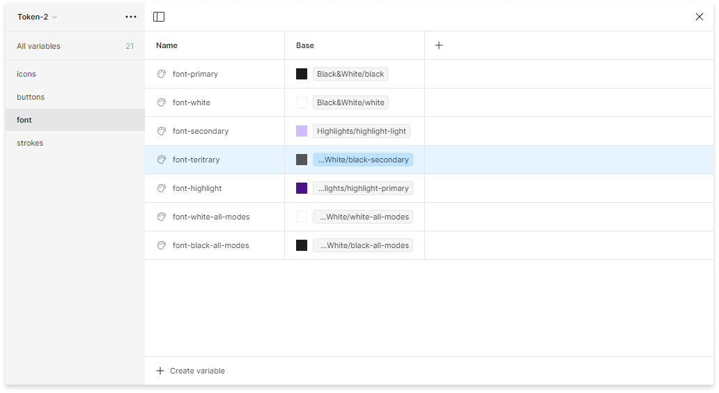
Example Font Definitions
Best Practices
Exclusively Use Tier 1 Tokens
Avoid using hex codes or Tier 0 variables. Instead, define required variables in Tier 1 and place the necessary hex colors in Tier 0. This approach prevents the hassle of redefining light/dark mode variables or client overrides at this tier, which will lead to management headaches down the road.
Keep Component Colors Out of Tier 2
Don't define colors for each component at this level (e.g., table-line-top, card-border, etc.). Keeping these definitions in Tier 2, which is included in all files, makes the color library dropdown hard to search and creates room for inconsistency and confusion across design teams. Component-level color variables should be managed in Tier 3
Tier 3+
Component Specific Colors
Tier 3
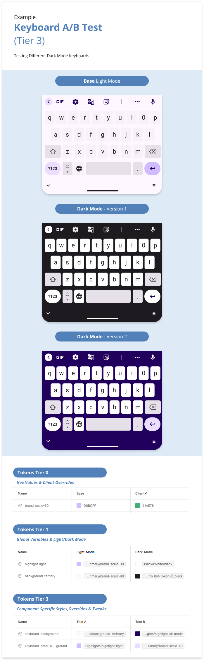
Tier 3 and beyond are for defining highly specific colors by component, especially useful for A/B testing and color testing. Depending on the complexity of your design system and needs, you might include multiple additional tiers. These are often stored locally in WIPs and usability test files, and usually reference Tier 2 or Tier 1 colors.
Examples of What’s Defined at This Level
Component Specific Variables
Highlights are typically pulled from your brand scales. These are used for items like buttons, backgrounds, icon colors, hyperlinks, and titles (which should be defined in Tier 2).
A/B and Color Testing
At this level, you can override specific individual elements in these tiers for A/B testing without affecting any client overrides or Light/Dark mode within a wireframe.
See example left.Works In Progress
You might define hex codes locally in the files. Once testing is complete and final colors are decided, they should be merged into the correct earlier tiers.
See example left for how to handle the black and white definitions.