Here is a UX breakdown of a projects I consulted on for my client EzBuild in 2019. EzBuild was an ecommerce hybrid site, which helped users explore and buy all compatible hardware components to build a computer.
Below I breakdown my UX process into the typical steps I take. First looking at the initial research I conducted and my methodology. Then I break down how I tabulate and use this data to build user flows and user personas. Using these I then show some of my design process, and how I utilize usability testing to help iterate.
Company Overview and UX Problem
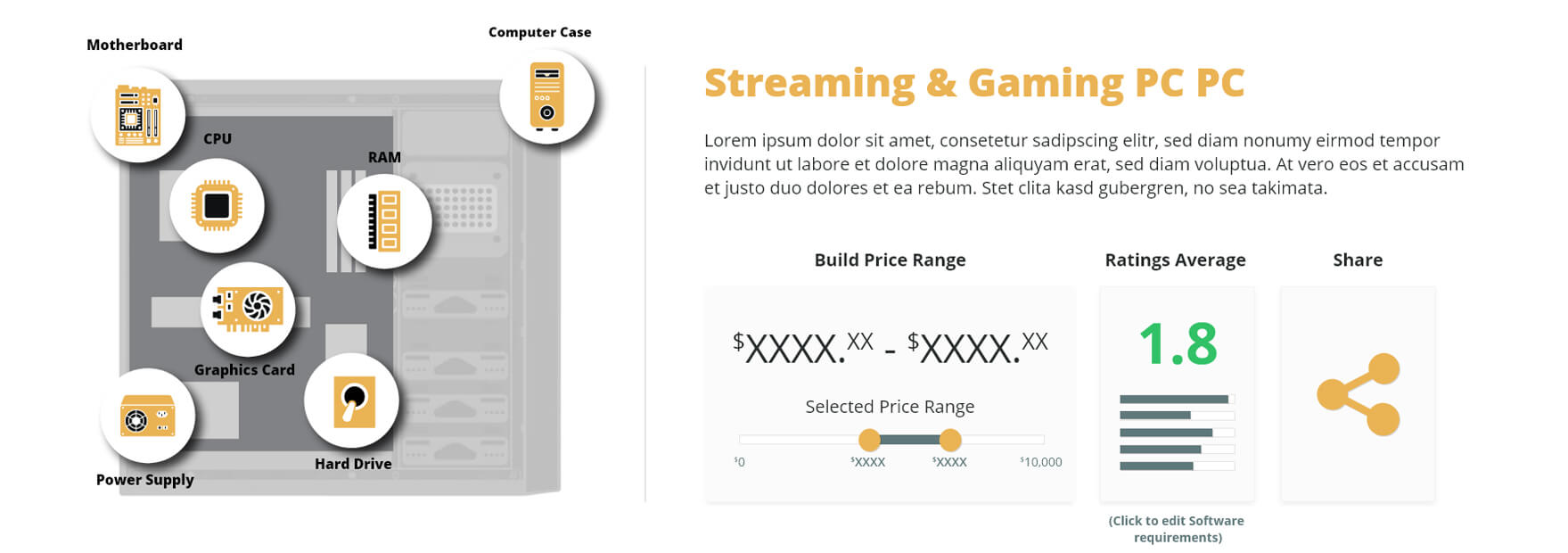
EzBuild aims to make buying and building a PC easier for users with beginner and intermediate levels of knowledge. Using proprietary algorithms and user needs surveys, EzBuild helps assess specific computer parts on the basis of 5 unique categories. The algorithm is tailored to a formula specific to the individual's needs, whether it be GPU intensive gaming, Multithread intensive rendering, or processor-heavy data analysis (plus many more use cases). EzBuild recommends the most efficient and compatible parts to get the most power for your dollar.
In our 2019 research, we found that potential users' number one barrier to purchasing and building a custom PC is their perceived low knowledge of computer hardware. Newegg (one of the most popular online PC hardware ecommerce stores) has over 3700 results for RAM alone, and the price variation for 16GB of RAM can be over $100. Even for customers with intermediate knowledge, this sheer amount of parts and price variations can be overwhelming.
Currently, the majority of PC build websites and apps on the market are aimed only at gamers. Whereas professionals who need to upgrade or build a PC for uses like graphic design, 4k video editing, 3D rendering, heavy data analysis and GIS applications need more than just graphics power.
EzBuild aims to launch in early 2021 as a white-label interface, operating on a marketing affiliate and advertising network model for revenue. EzBuild gives partners and streamers the ability to confidently recommend full PC builds to their users while opening up a new revenue stream.
UX Problem
How can EzBuild help individuals with low to intermediate knowledge of computer hardware confidently find/purchase efficient and compatible parts that meet their specific software and or gaming needs?
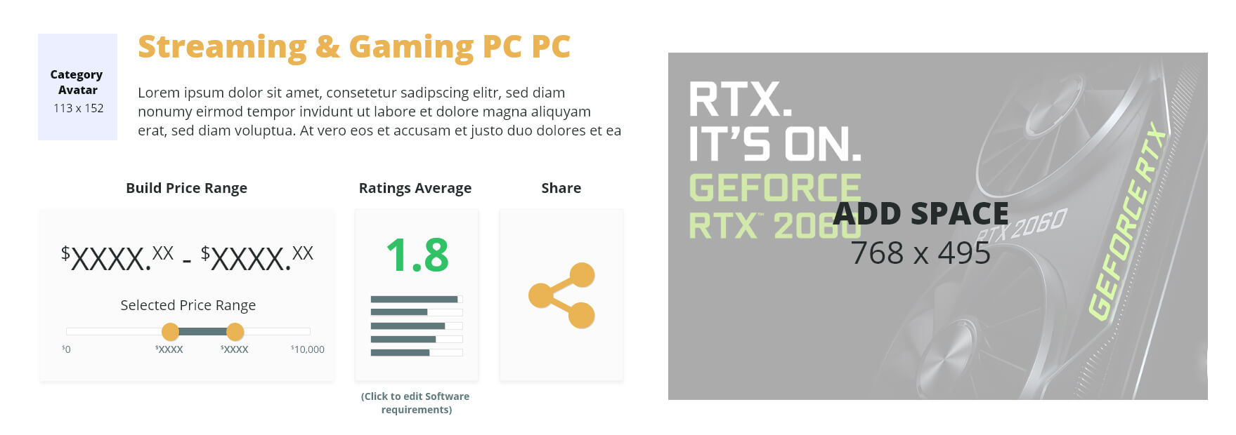
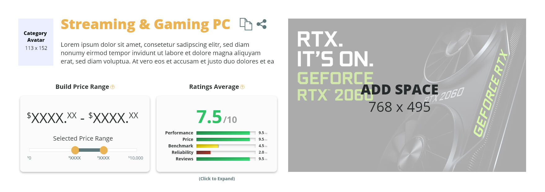
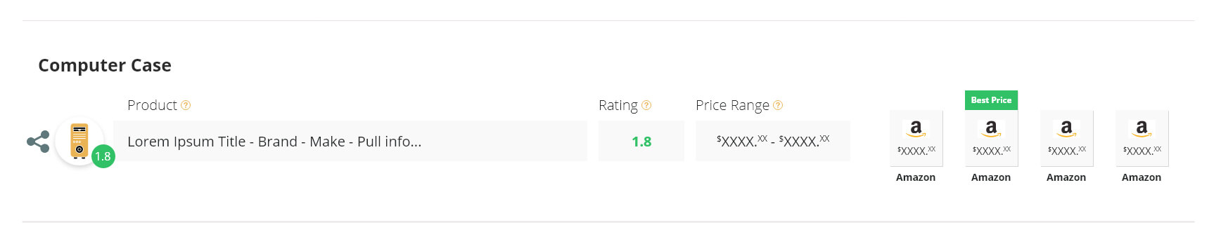
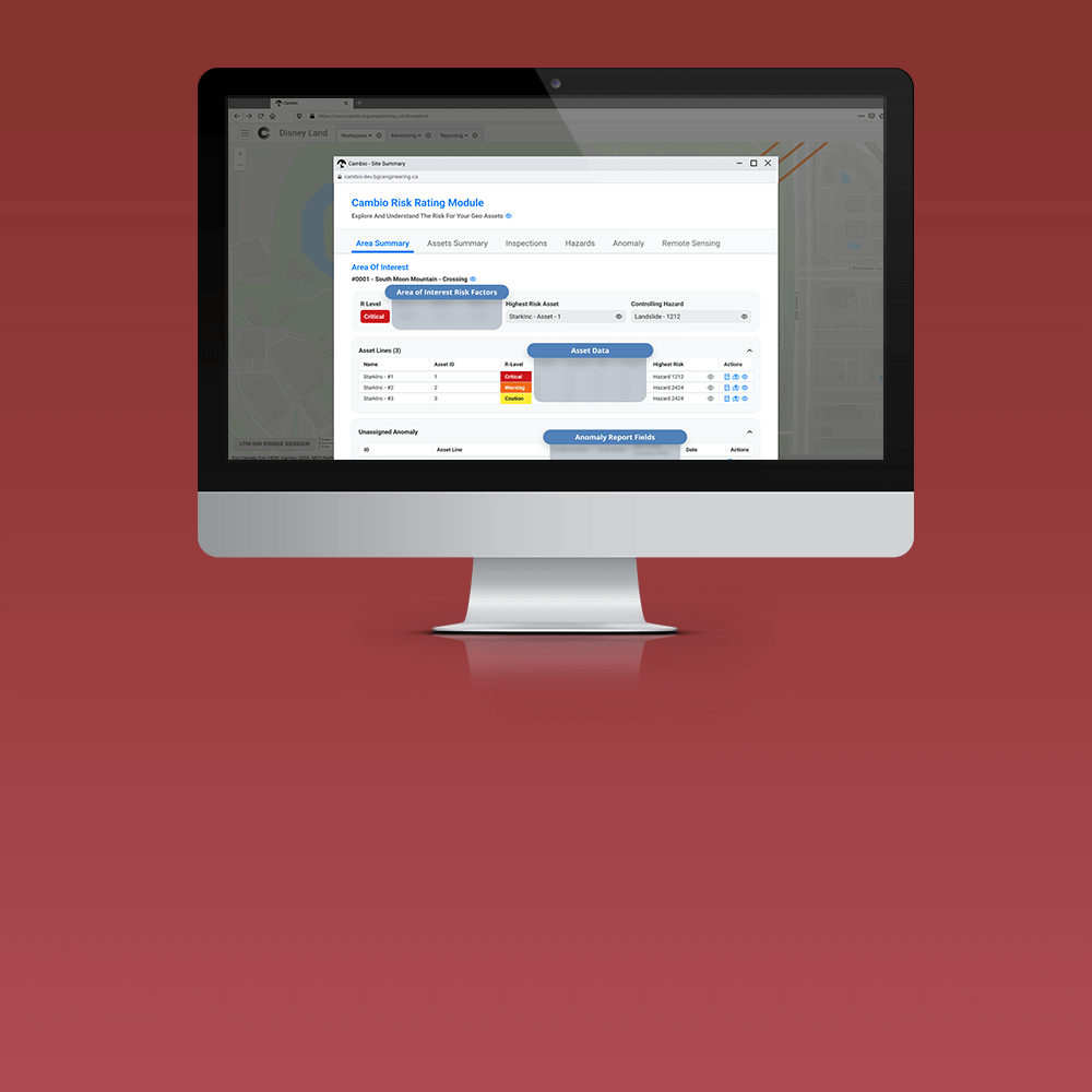
Final Designs
Competitive Analysis & Market Research
Summary
Key Pain Points
Research Methodology
Usability testing
I conducted 3 rounds of usability testing, utilizing usertesting.com. 25 respondents per round were tasked with interacting with two computer building sites (a total of 5 competitors sites were tested). Users were asked open-ended qualitative questions about their opinions and experience, then were required to fill out a 25 question quantitative survey.
Guerilla testing
Over 3 days, I conducted in-person interviews with 25 customers exiting brick and mortar stores (2 Memory express’ and 1 best buy). Interviews were conducted with customers who had either purchased computer parts or expressed interest in building a computer. Interviews consisted of open discussion and open-ended qualitative questions. Respondents were then asked to fill out the online 25 questions quantitative survey for a gift card, with a 75% response rate.
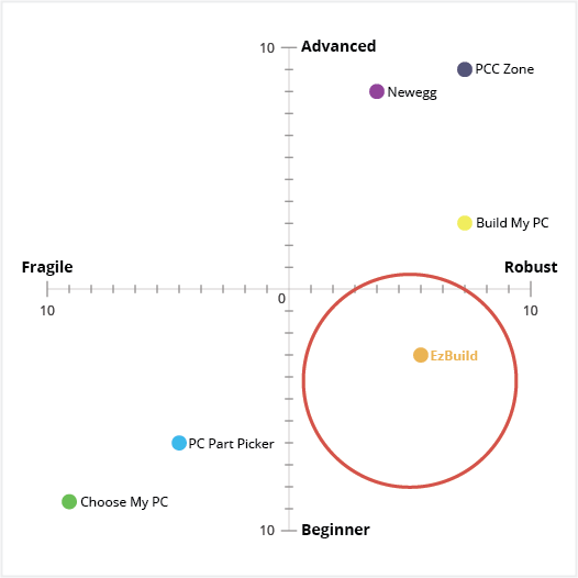
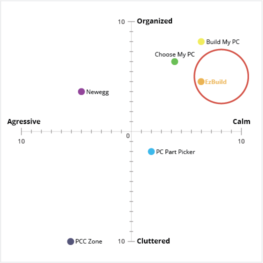
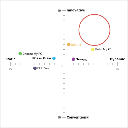
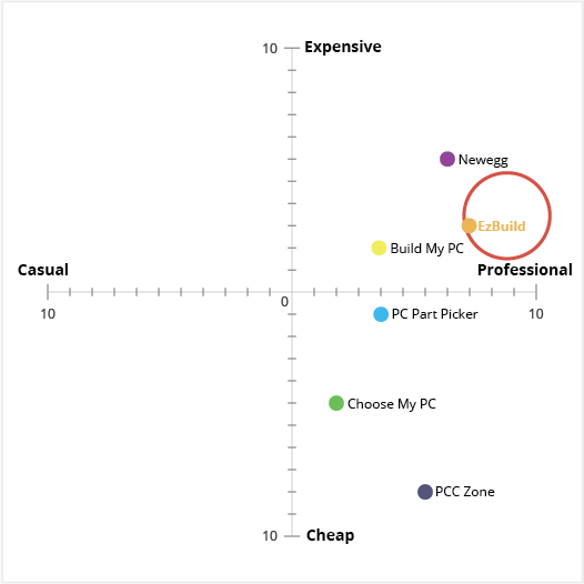
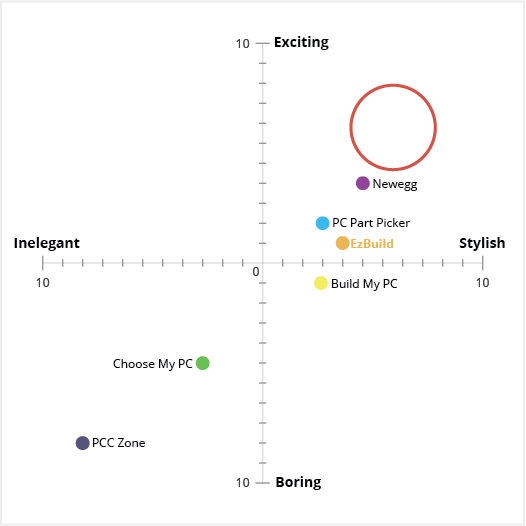
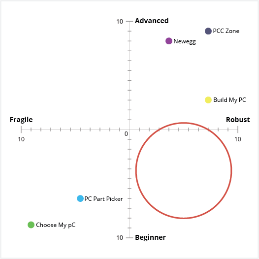
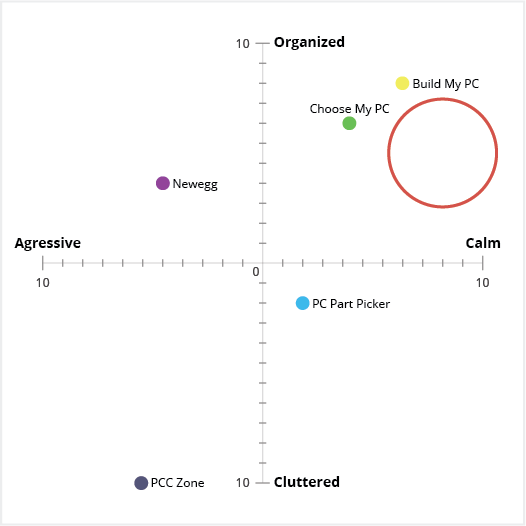
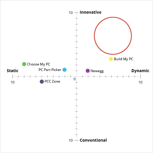
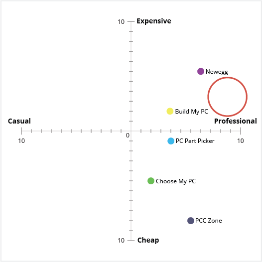
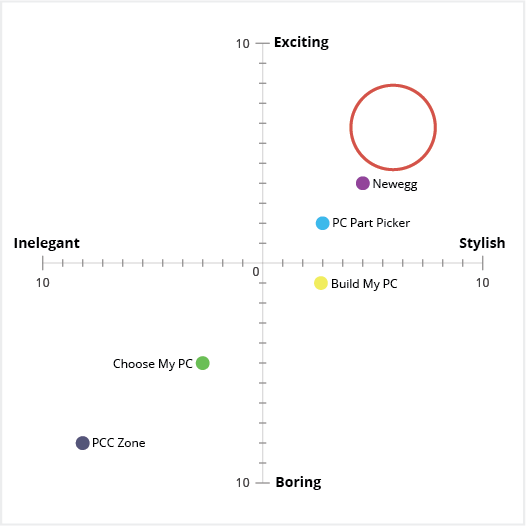
Perceptual Maps
Coming from a marketing and consumer behavior background, I'm a big fan of using perceptual maps to help break down and quantify the qualitative responses you find in UX usability tests. To do this I record adjectives that respondents use to describe the design and experience. I then classify and cluster them: words with similar meanings are combined and ones with opposite meanings are paired. In the subsequent quantitative surveys, I use synonyms and antonym scales as a control to validate the qualitative feedback.
I’ve found it’s helpful to take an initial baseline in the competitive analysis and market research stage to Identify market gaps and help identify keywords we are looking for in subsequent tests.
T5 groupings (of 10) are shown below. The red circle indicates a market gap that we want our product to fill, and keyword categories we want to hear in the usability tests of our product.
Click below to expand
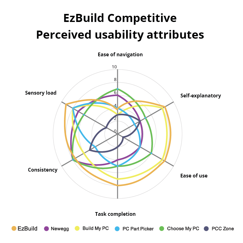
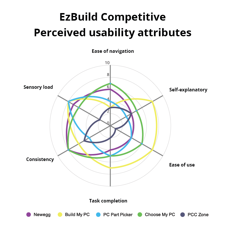
Perceived Usability Attributes
Taking the qualitative feedback on actions and task execution, I categorize them into perceived usability attributes categories (below are 6 examples of 15). In the quantitative survey, I use synonyms and antonym scales as a control to validate the qualitative feedback for attributes.
- Ease of navigation
- Is there a need for more (or less) navigation clearer instructions, or are users having issues going back to previous steps?
- Self-explanatory
- Is the product intuitive, did the user find themselves wondering what the next step was or what one of the instructions meant?
- Task completion
- How long did it take users to perform an action.
- Ease of use
- Is the interface easy to use?
- Sensory load
- Does the user's eye follow a normal and consistent visual hierarchy. What is the first thing they notice on the page? What headings do they notice, what instructions do they skip over or miss? Is there too much content on one step/page for the user to digest?
- Consistency
- Does the next step/next page seem to fit with the last (UI and UX).
Click below to expand
User Flows
Since there are quite a few competitors in the market, it was easy to have an open dialog with users in both the in-person and online surveys about user flows. Users were asked to compare and contrast selected competitor’s flows. I found there were 3 main categories:
- The user is asked a survey first (examples: pcczone.com, choosemypc.net). User flow is typically (Survey Completed build Part) or (Survey slate Component Part).
- The users start out with a blank slate, where components they need are highlighted and the user is then responsible for selecting individual parts (examples:newegg.ca, buildmypc.net ). User flow is typically (Blank slate Component Part).
- The users can select from already built systems (example: pcpartpicker.com ). User flow is typically (List of complete builds Breakdown of completed build Part).
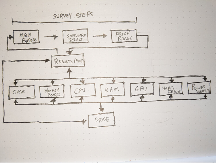
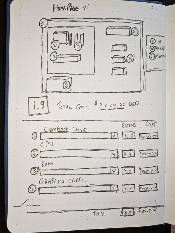
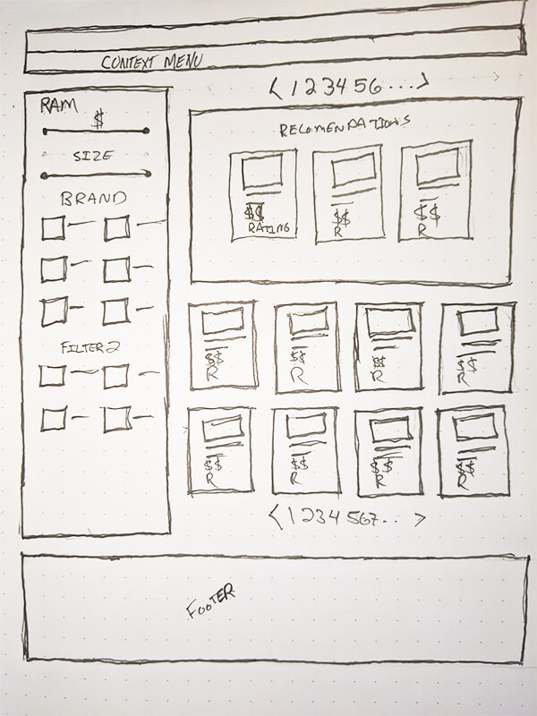
Initial Sketch
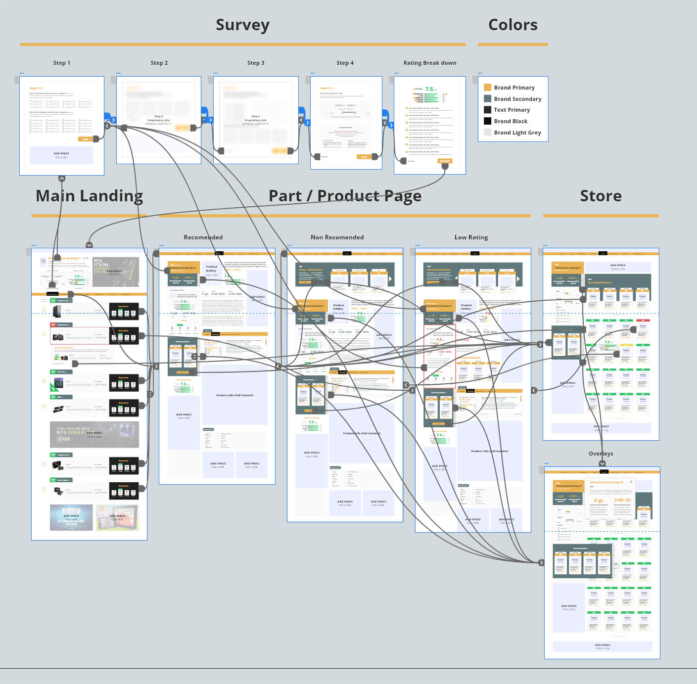
Final Wireframe
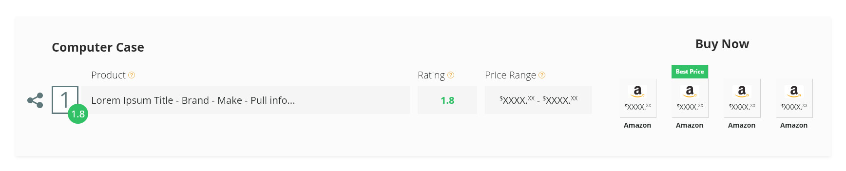
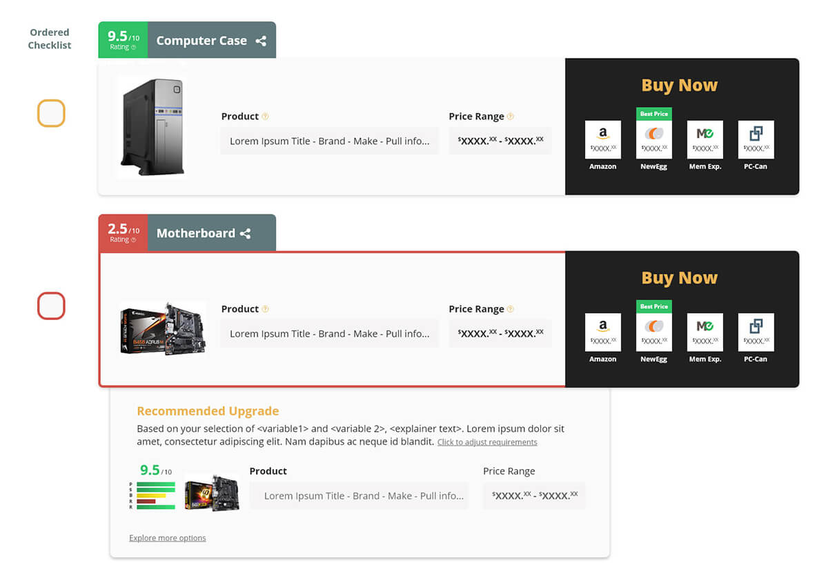
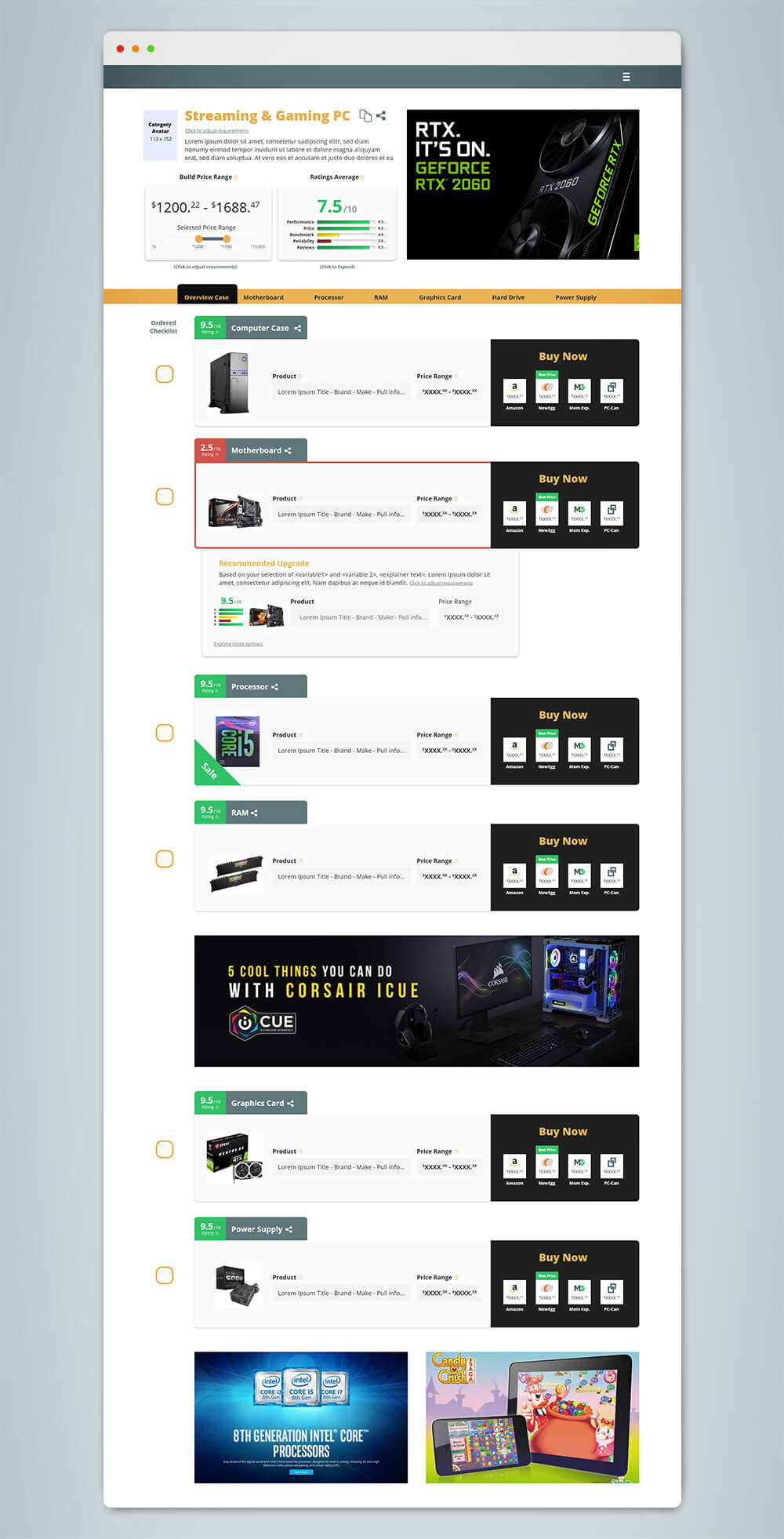
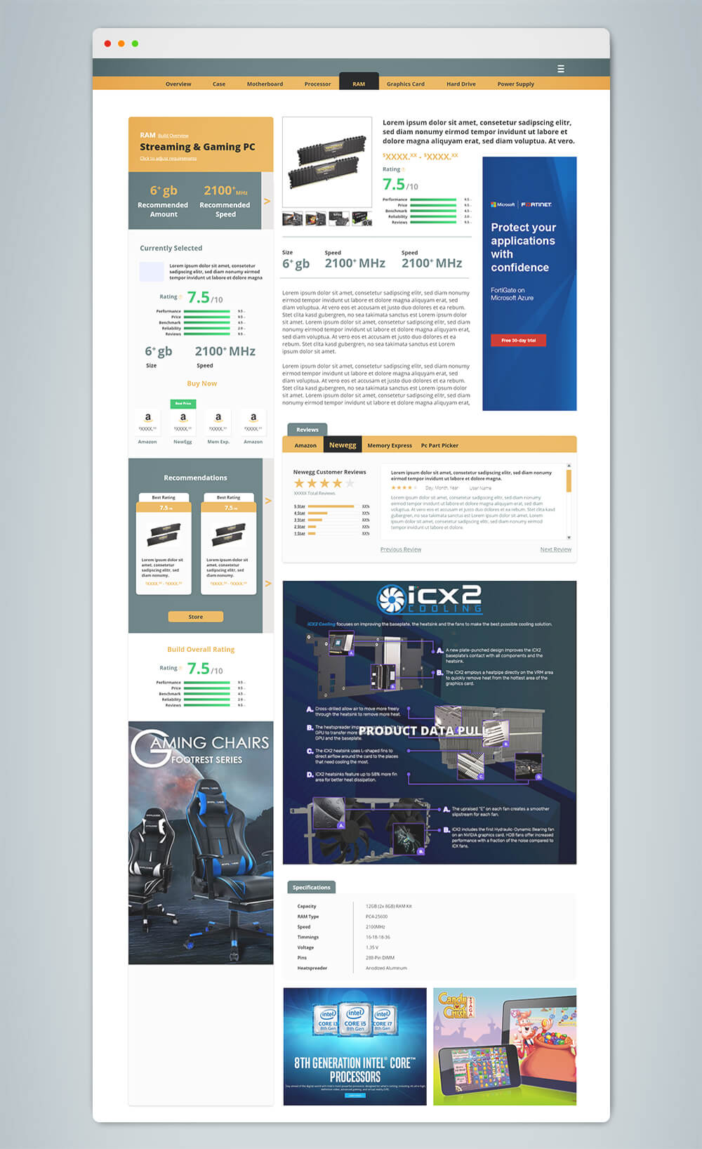
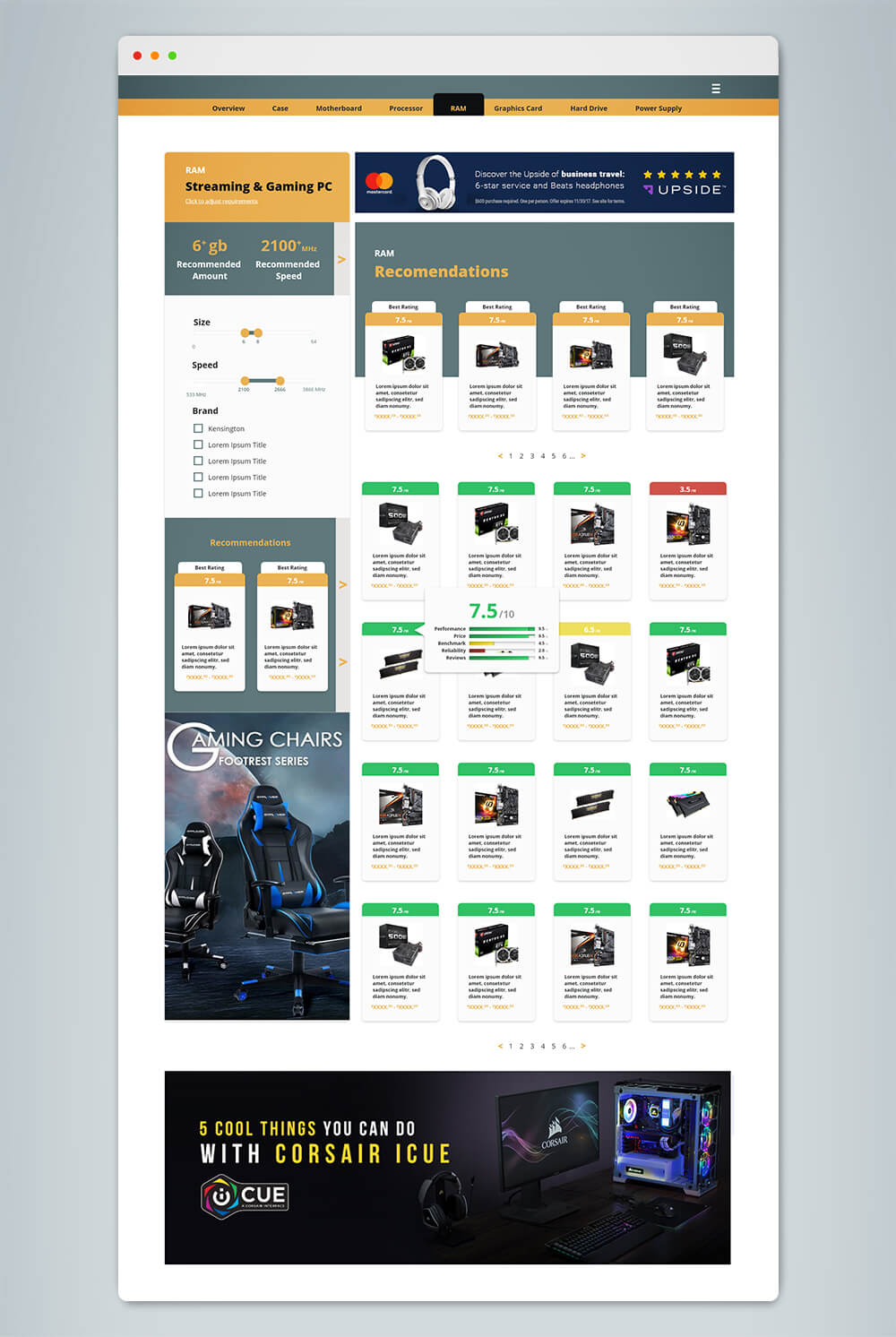
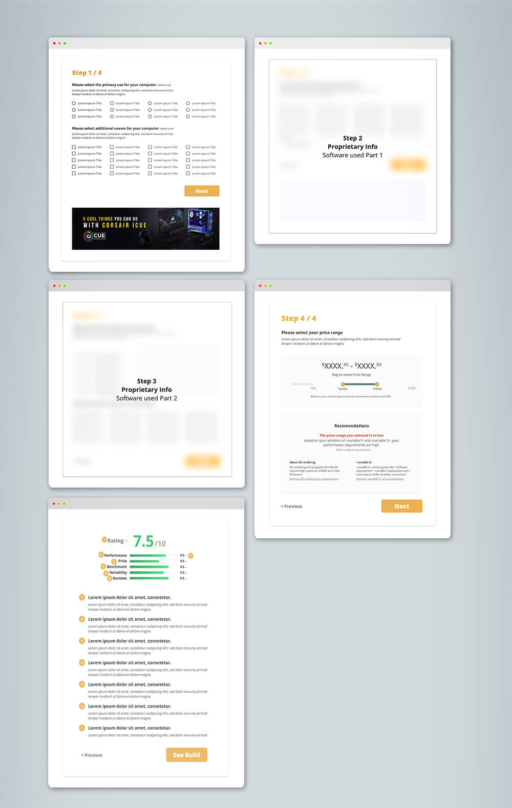
Initially, we were planning to follow a (Survey Blank slate Store) flow. However, in the initial competitive analysis, we found that we wanted to focus on the beginner and intermediate segment, which I identified as a market gap and offer the biggest user base. Through the interviews and collected quantitative data, we found the “blank slate” is more suited for an intermediate/expert user who already understands the parts they need. Because of this, we changed our model to something more unique from our competitors. (Survey Completed Build Component Recommended parts (4) (optional) Store individual parts). This allows users more customization than just a completed build while still keeping the user’s required knowledge low. Recommended parts are based on multiple factors which include the software, price range and main use cases selected in the survey. This also continues into the store where the algorithm ranks parts specific to the user’s requirements. This creates a positive personalized sales experience tailored to the user’s specific needs.
User Personas
Based on the competitive analysis, market research and usability testing, I create user personas. I typically try to keep the represented distribution close to the same as the use cases.
Chris
Sex: Male
Age: 16
Occupation: Highschool student
Income: Paid research
Knowledge level: Beginner
Use cases: Gaming, video streaming
Types of Games: FPS, mmorpg FPS, mmorpg, strategy, simulation, action adventure
Price Range: $800 - $1000
Income: Proprietary
Algorithm Change: Proprietary
Main Pain points Proprietary
Steven
Sex: Male
Age: 19
Occupation: College student
Income: Paid research
Knowledge level: Beginner
Use cases: Gaming, office suite, streaming.
Types of Games: FPS, mmorpg, strategy, simulation, action adventure
Price Range: $1200 - $2250
Income: Proprietary
Algorithm Change: Proprietary
Main Pain points Proprietary
Linda
Sex: Female
Age: 27
Occupation: Video editor
Income: Paid research
Knowledge level: Intermediate
Use cases: 4k rendering, VR stitching, sound design, 2d/3d animation, color correction
software: After effects, Premier Pro, Audition, Avid Media suite
Price Range: $2500 - $4500
Income: Proprietary
Algorithm Change: Proprietary
Main Pain points Proprietary
George
Sex: Male
Age: 33
Occupation: 3D animator
Income: Paid research
Knowledge level: Intermediate
Use cases: 2d/3d animation, 3d modeling, rendering.
software: Maya, 3D Max, Mudbox, Cinema 4D, Zbrush, After effects.
Key Hardware needs: $4500 - $8900
Income: Proprietary
Algorithm Change: Proprietary
Main Pain points Proprietary
Some areas have been removed at the request of EzBuild. In the competitive analysis and market research section above you can see some examples of general pain points, and here are some examples of some of the additional fields data:
- Key hardware needs
- Program A benefits more for multi-thread processing due to multitasking.
- Algorithm Consideration
- AMD processor has a higher rating for multi-threaded processing.
Usability Testing
Methodology
In-person focus group, one-on-one interviews
After compiling the user personas, I like to go through the surveys for the competitive and market research analysis to find a focus group of 5 - 10 respondents who represent the user personas and ideal target market. I find having a consistent repour with the target market/user personas (who see each iteration), leads to a better consistency of feedback, and allows for better insights into subsequent changes. During the first usability test, it also allows me to better understand and document user personas pain points.
In-person interviews were conducted over Zoom due to COVID. Each session consisted of 2 parts and took the respondent 30 - 40 mins. Users are given gift cards for each useability test they take part in. The in-person interviews were conducted in two parts:
Part 1
A guided discussion for feedback on specific features being tested for that round of usability testing, and updates to the product from past iterations. Open-ended questions ranged from UI design, functionality and usability testing to task execution. Time to complete the task and open-ended discussion results are tabulated into usability attributes and perception maps then compared to the general population group results.
Part 2
A 25-30 question quantitative questionnaire. Task examples include ranking 10 features from most favorite to least favorite, synonym and antonym ranking scales, ranking of future features and more. Both the focus groups’ quantitative and general usability groups (see below) quantitative results were used as a control method to validate results between the focus group and the general population.
General population usability testing
To help further rule out cognitive bias from both the focus group and myself, I like to have a 2nd usability group made up of random participants conducted through usertesting.com, to represent the general segment of our ideal user. In this case, users were interested in building a customized PC and listed their knowledge as a beginner to intermediate. Each round consisted of 8-10 respondents, and was conducted in two parts:
Part 1
Users are asked to perform 5 set tasks (for example to change the build’s RAM), based on features and updates we are testing. Time to complete the task and open-ended discussion results are tabulated into usability attributes and perception maps then compared to the focus group results.
Part 2
Users are given the same 25-30 question quantitative survey the focus group received.
Test Breakdown and goals
Click below to see each test's goals